
Tableau alternatives are business intelligence tools you can use instead of Tableau to build dashboards, explore data, and share reports. Some match Tableau on visualization. Others take a different path and include the data layer that Tableau assumes you already have.
Tableau is one of the most capable visualization tools on the market. It also expects clean, modeled data to arrive from somewhere else. BEEM is a managed data platform that takes a different angle. It brings connectors, a warehouse, transformation, and dashboards together in one place, and it can still feed Tableau if you want to keep it.
So the real question is not only which chart tool looks best. It is whether you need a standalone Tableau at all, or a platform that handles the data underneath it too.
Why teams look beyond Tableau
Tableau turns modeled data into interactive dashboards. It sits at the top of your stack and shows what the numbers say. The work of collecting, storing, and cleaning that data happens before Tableau ever opens. Three things push teams to look around.
- It only covers the top layer. Tableau visualizes data. It does not pull from your sources, store history, or model raw tables. You still need connectors, a warehouse, and transformation to feed it.
- It assumes clean, modeled data. Tableau shines when data is already tidy. If your tables are messy, dashboards break or mislead. Someone has to do that modeling first.
- Per-user licensing and expertise add up. Tableau uses per-user Creator, Explorer, and Viewer licensing. Costs climb as teams grow, and skilled Tableau developers are not cheap to hire.
The top Tableau alternatives at a glance
The strongest Tableau alternatives are Power BI, Looker, Qlik Sense, Metabase, Google Looker Studio, and BEEM. The first five are visualization tools that sit on top of a data stack you build yourself. BEEM is an all-in-one platform that includes the data layer, and it feeds a BI tool if you keep one.
| Platform | Type | Pricing model | Implementation complexity | Best for |
|---|---|---|---|---|
Recommended | All-in-one managed data platform | From $899/mo + usage ($0.60/DPU, $0.10/GB) | Low | Mid-market teams that want dashboards without building a data stack |
| Tableau | Visualization and BI | Per-user (Creator, Explorer, Viewer) | High | Analysts who need deep, flexible visualization |
| Power BI | Visualization and BI | Per-user, low entry tier | Medium | Microsoft and Excel-centric teams |
| Looker | BI with semantic modeling | Platform pricing, usage-based | High | Governed metrics on a warehouse |
| Qlik Sense | Associative analytics | Per-user plus capacity | High | Free-form data exploration |
| Metabase | Open-source BI | Free self-host or paid cloud | Medium | Simple self-serve on an existing warehouse |
| Google Looker Studio | Free dashboarding | Free, paid Pro tier | Low | Marketing reporting on Google data |
Tableau alternatives compared
Each tool below solves a real problem well. The right pick depends on your stack, your team, and whether you already own the data layer. Here is how the main options compare.
Power BI
Power BI is Microsoft's business intelligence tool and Tableau's closest rival. It offers a low per-user entry price, tight links to Excel, Azure, and Microsoft Fabric, and a large community. Teams already living in Microsoft tools often find it the natural choice. Its DAX language is powerful once you learn it.
The tradeoff is that authoring still happens in a Windows desktop app, and reports get complex as models grow. Power BI also delivers the most value inside the Microsoft stack, which is limiting if you are not there. Like Tableau, it visualizes data but does not collect, store, or model it. You still assemble a data layer behind it. For a deeper look, see our Power BI alternatives comparison.
Looker
Looker, now part of Google Cloud, takes a modeling-first approach. You define metrics once in its LookML layer, and every dashboard reads from that single source of truth. This makes governed, consistent numbers across a company, and its embedded analytics are strong for building reporting into your own product.
The catch is the learning curve. Someone has to build and maintain the LookML model before anyone sees a chart. Looker uses platform pricing that gets expensive, and it is heavy for small teams. It also queries your warehouse live, so you still need a warehouse and clean tables underneath it. Our Looker alternatives guide compares the closest options.
Qlik Sense
Qlik Sense uses an associative in-memory engine that lets people explore data freely, without predefined drill paths. You can click any value and see how everything else relates to it. That model is genuinely different from the query-per-chart approach of most BI tools, and it suits open-ended analysis.
The downside is a proprietary scripting language and a real learning curve for builders. Licensing combines per-user and capacity costs, and the community is smaller than Power BI or Tableau. Qlik still assumes prepared, modeled data arrives from your own pipeline.
Metabase
Metabase is an open-source BI tool you can self-host for free or run as a paid cloud service. Its question-builder lets non-technical users ask questions in plain language and get charts back, so it sets up fast and spreads easily across a team. For lightweight self-serve analytics, it is hard to beat on price.
The limits show up at depth. Its visualization and governance features are lighter than Tableau, and advanced modeling is basic. Metabase also queries a database you provide, so you still run a warehouse and keep it clean behind the scenes. It shines on top of an existing, well-modeled warehouse.
Google Looker Studio
Google Looker Studio, formerly Data Studio, is a free web tool for building and sharing dashboards. It connects easily to Google data like GA4, Google Ads, Sheets, and BigQuery, and sharing a report is as simple as sharing a document. For marketing reporting on Google sources, it is a fast, no-cost start.
Performance and modeling limits appear on large or non-Google datasets. It is not the governed Looker platform, and its advanced visualization options are fewer than Tableau. Looker Studio works best for marketing and web reporting, not enterprise BI across many sources.
BEEM
BEEM takes a different approach from every tool above. Instead of adding another dashboard tool on top of your stack, it is a managed data platform that includes the data layer itself. BEEM brings together 750+ connectors, a built-in warehouse on Amazon Redshift, SQL transformation, and built-in dashboards with AI Dashboards that build a view from a prompt. It is not a Tableau replacement for visualization depth, and it is honest about that.
What BEEM replaces is the hidden stack a BI tool needs to work. Dashboards stop being a manual-refresh island because the connectors, warehouse, and modeling all live in one place, refreshed on schedule. If your team loves Tableau, keep it. BEEM feeds it clean, modeled data. BEEM plans start at $899/mo, plus usage-based data processing from $0.60 per DPU and storage at $0.10/GB. You pay one vendor for the whole stack instead of separate bills for connectors, a warehouse, transformation, and a BI tool. The first dashboards can land in as little as 2 weeks, and an expert team is available when you need one. It suits mid-market teams that want outcomes without assembling five tools. For a broader view, see our Snowflake competitors guide.
How to choose between Tableau alternatives
The best choice depends less on chart styles and more on what you already own. Work through these five criteria before you commit.
- Do you already have a data layer? If connectors, a warehouse, and transformation exist, a pure visualization tool fits. If not, an all-in-one platform saves you from assembling one.
- Who builds the dashboards? Analysts, engineers, and non-technical users each suit different tools. Match the builder to the tool's learning curve.
- What is your existing stack? Microsoft teams lean Power BI, Google teams lean Looker Studio, and AWS-centric mid-market teams fit BEEM well.
- What is the total cost? Add per-user licensing to the hidden cost of the data engineering that feeds the tool. A data engineer runs $120K+ per year.
- What about governance and residency? Check RBAC, audit, compliance, and where data lives. Canadian teams often need residency in AWS ca-central-1.
The all-in-one alternative
Most Tableau alternatives are another layer of charts on a stack you still have to build and maintain. BEEM is the option that includes that stack. It is a managed data platform with connectors, a warehouse, transformation, dashboards, and AI Insights in one place, backed by an expert team when you need one.
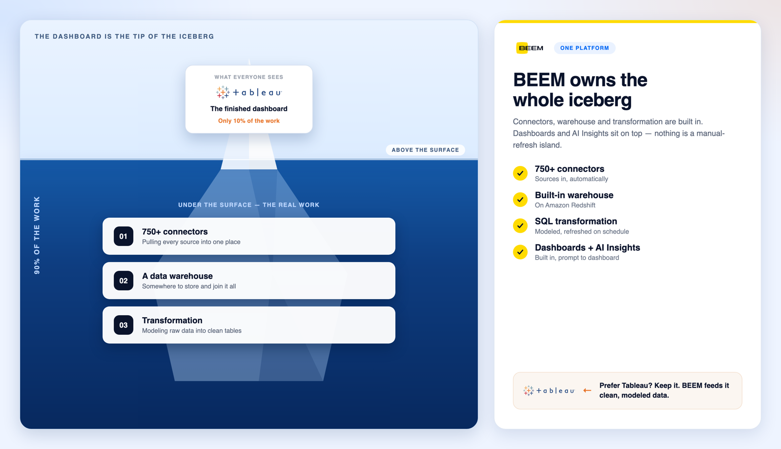
To be clear about fit, BEEM is not the deepest visualization tool. If you need pixel-perfect design and the richest chart library, keep a dedicated BI tool like Tableau. BEEM does not do real-time streaming, and it runs as a scheduled refresh in the cloud. It is the alternative when you want the data layer and dashboards managed as one thing, with security, RBAC, audit, and Canadian residency built in. And it still feeds your BI tool if you keep one.
Want to see your own data in a dashboard before you decide? Book a demo and watch BEEM turn your sources into live dashboards, or explore the full platform.
